
Crate & Barrel
SUMMARY: CRATE&BARREL is a retail chain offering a variety of stylish furniture, kitchenware & other home essentials and was the subject for my second project at General Assembly.
The Problem
Users wanted the room in their house to inspire a feeling not just a look while staying on budget.
The Challenge
- How can I effectively honor both user needs and company needs?
- What is the best way to design for an emotion?
PROTOTYPE

RESEARCH
In order to get some feedback on how people navigate the current Crate & Barrel site I interviewed potential users. I also did card sorting and reviewed the customer summaries provided by Crate and Barrel.
I knew that the existing crate and barrel site has various lists and menus and that a user could navigate through. However with the new site I wanted to make sure that the navigation was as easy and as intuitive as possible. However after completing several rounds of card sorting and also a a site map I realize that focusing on the organization of the navigation did not solve any of the user problems.
Card Sorting
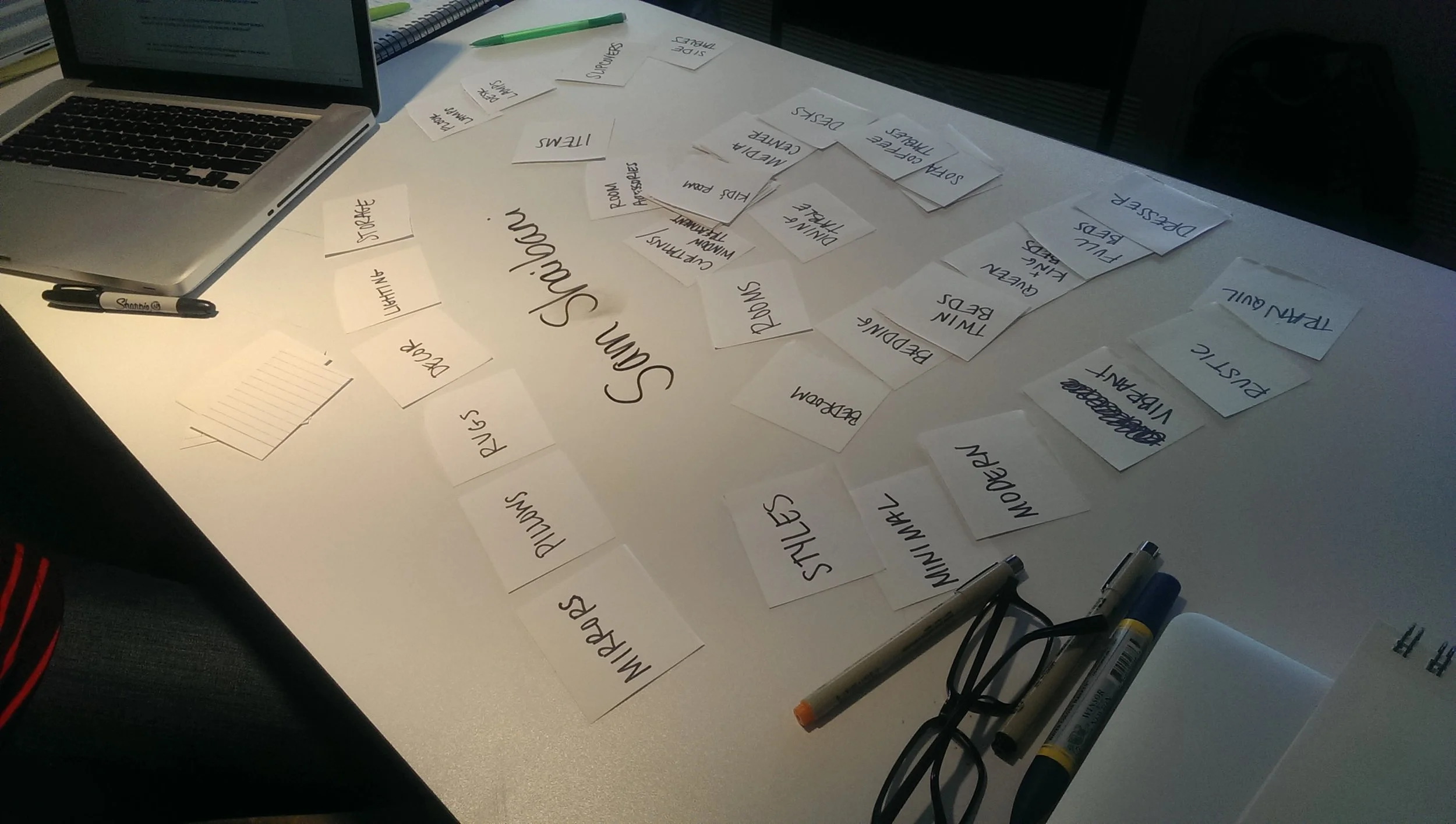
Site Map

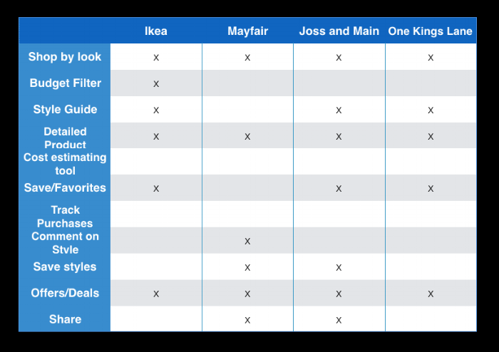
Competitive Analysis
The first step that I tackled for this project was to complete a competitive analysis. During this phase I compare Crate and Barrel to companies that offered similar services. This allowed me to see where other home design companies were excelling and lacking.
After refocusing on the user problem and going back to my interview notes I realized that
1. Users needed help designing a "feel" for a room. But how do you design for an emotion?
Solution: I thought a quiz would be a great way to begin the experience.
2. Budget and ways of saving were a big concern for most users.
Solution:Adding budget tracker so users could easily set and track their spending.
3. Design terms like "rustic" or "modern" were confusing for many users.
Solution: Inspired by Facebook I decide to use images as the way users could communicate a "feel" in a room.
MVP
- Homepage that includes a room personality quiz
- And The love list where users could save favored items
- The budget tracker
- Share options
MOBILE & WEBPAGE WIREFRAMES


ANNOTATED PROTOTYPE (4 Pages)

What I Learned
- Think more outside the box at the beginning of the project
- Expand what could be included in the competitive analysis
- Do more research on existing furniture stores and competitors
- Do more User Testing to guide design choices and content.